The internet, at first: ugly, funny, hard to use
And then: sleek and cool
And now: ugly, not funny, impossible to use
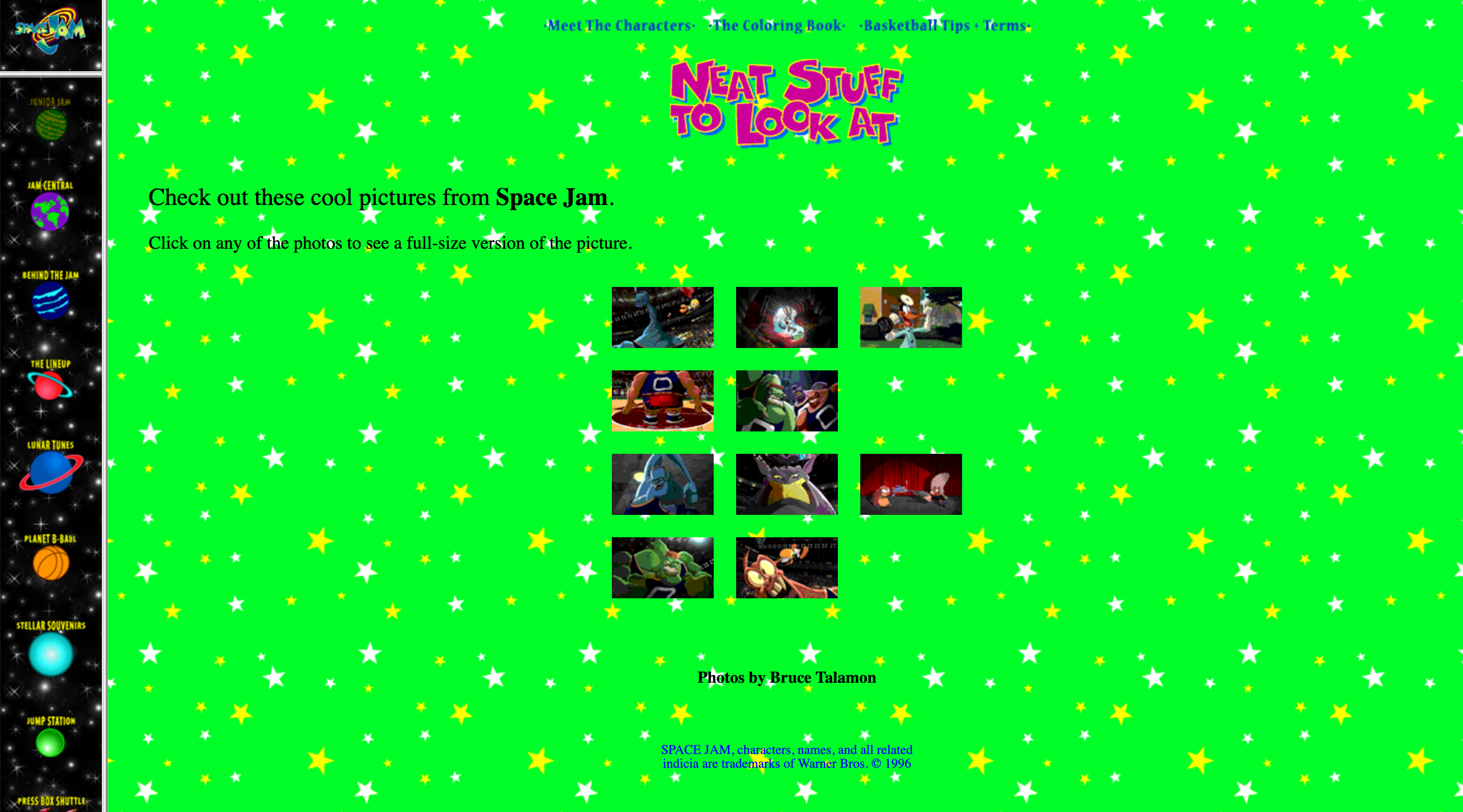
Look at this awesome website. Can you believe the web used to look like this? This is the ugliest thing I’ve ever seen, but also the best thing I’ve ever seen. I don’t recall if I ever visited this site when I was a child, but if I did I probably had a great time. This page on the Space Jam site is just called ‘neat stuff to look at’. The ‘neat stuff’ is just a few screenshots from the movie, and the colour of the background will be forever etched in my retinas.
The cool thing is, spacejam.com was built by professionals (I mean… I assume?). And then this site was built by an individual on Geocities. It is their personal homepage. It looks just as bad (or good, depends how you look at it) as Space Jam’s. Or what about this - it’s written in third person which suggests this is their ‘professional page’ which maybe is what you did before Linkedin? I don’t know.
In our nowadays-eyes, these all look roughly the same: like a janky mess. That’s because two decades ago, designing for web wasn’t really a thing yet. Also, we didn’t know what the internet even was yet. Like, at first it sort of just was ‘neat stuff to look at’.
So yeah for a few years we all just plodded along enjoying cool animated banners and full-width Times New Roman babble about personal hobbies and ‘interesting links’. BUT THEN: we all learned what a social network was. Now, social networks are not solely responsible for what changed, but they were a very visible part of it.
In 2003 Myspace slowly seeped its way into our internet lives. We had a central place to create our own cool pages containing cringy photos of your thirteen year old self and intense animated backgrounds which took roughly three whole minutes to load on your dial up connection and very likely used up most of your RAM. So Myspace was kind of like Geocities in that you could really make your page look like your own, but with the added bonus of connecting with others. Like this guy, Tom.
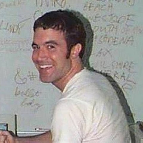 Myspace co-founder and everyone’s first ‘friend’.
Then somehow we all got Zuckerberged and Facebook took over as ‘coolest social media’. And what did this mean? Suddenly, apart from the actual content, ‘your homepage’ looked just like everyone else’s. Facebook had no room for animated sparkles and flashing text and whatever other crap we liked in the early naughties.
This slight dampening of self expression wasn’t just ‘the man’ saying ‘the internet isn’t a toy, kids’. It was the emergence of standards in web design. Facebook is only one example of how online things became prettier and nicer to use. Actually Facebook is a terrible example of this - personally I hate that shade of blue and I think it’s just awful to use.
But look at these cool sites that we have now, like feed music and e-flux. From spacejam.com to now, we’ve learned the value of online user experience. We’ve been using the web for long enough now that we know what works and what doesn’t, and what looks good and what doesn’t.
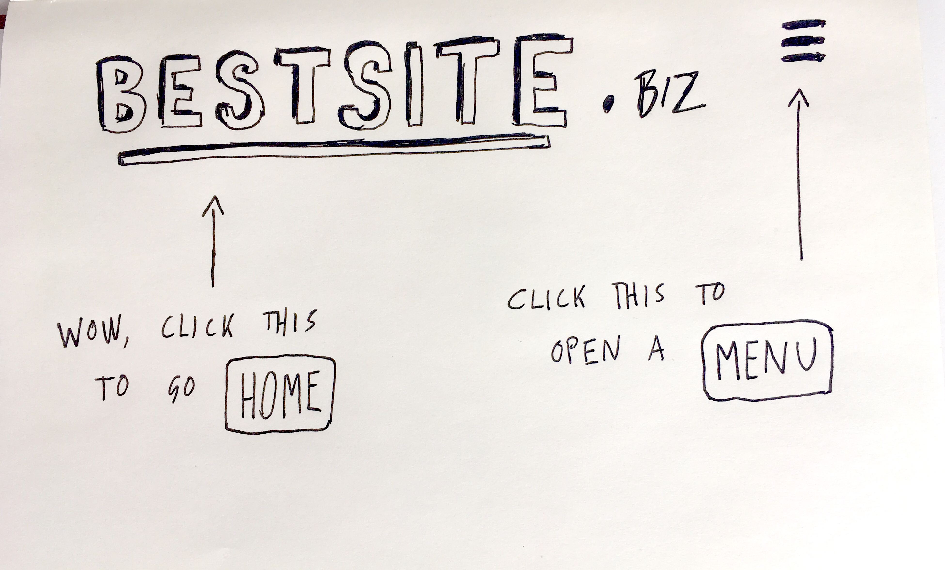
For instance: what about navigation bars? I don’t even remember what it was like before those existed. And then, the idea to put the nav bar on every page (oh wow, no more clicking the ‘back’ button every thirty seconds). And then, making the title of the website a clickable link that takes you back to the homepage. And then, doing away with nav bars and using the hamburger icon. I could go on forever - hopefully you get my point.
Yes, the current look and feel of the internet is all a complex tapestry of our collective growth towards understanding what constitutes ‘good’ web design. The things I’ve mentioned so far only scratch the surface. Also, they don’t matter any more.
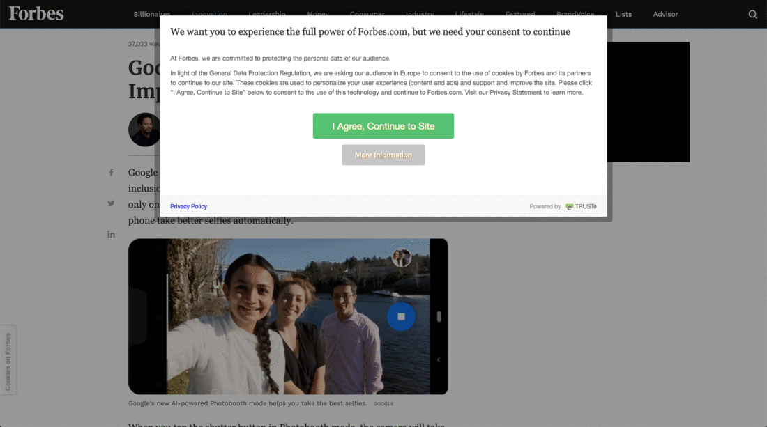
Because, as you can see, it’s impossible to look at the content you want to look at without first being confronted by a stupid, ugly, BANNER. These have seriously disrupted the way we casually peruse the internet. It’s like popping into the newsagents for an Orangina, but there’s a sweaty, smarmy salesperson blocking the door, rubbing their hands together and squeezing out a disturbing grin while saying, “please read and sign this before entering. Also, have a cookie.”
Ew no get away from me with your inedible cookies. And in all seriousness, what is this crap? Didn’t any of you know that GDPR was coming? Are these intrusive, unnecessary cookie banners and privacy notices really the best you could think of? Some organisations even use the method shown below, where you either agree to being tracked by them (and their third parties) online or you decline and are forced to visit a plain text site.
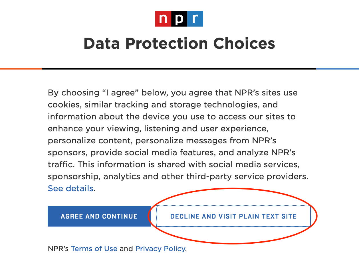
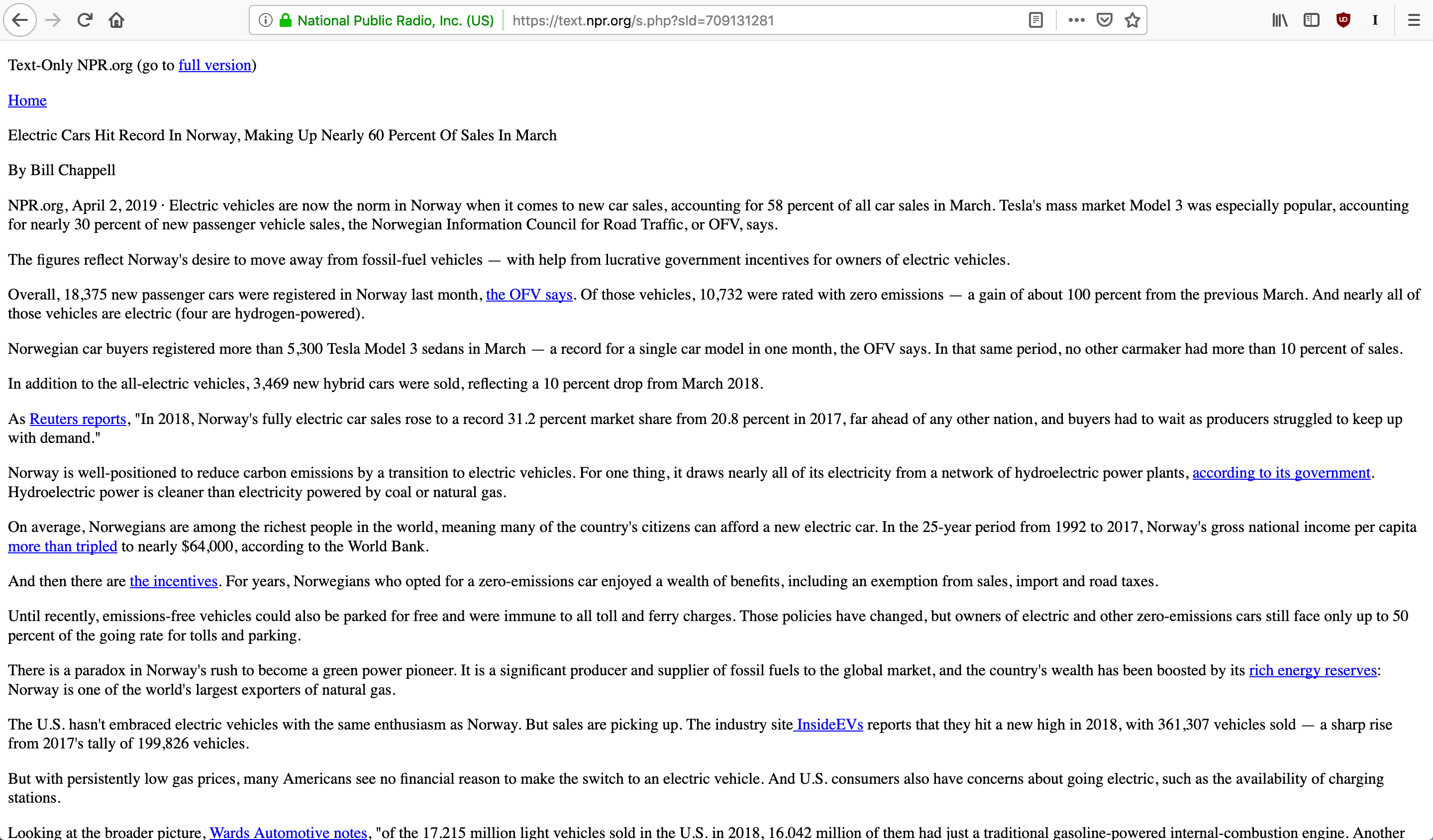
Okay well… this looks worse than how the internet looked before we understood what web design was. Yes that’s right, not the same. Just worse. That means we’re going backwards instead of doing what makes sense. Which is going forwards. Going forwards entails finding effective solutions to new problems, not crappy quick-fixes which smack of zero-effort.
Choosing to have a clean safe online experience should not mean that you have to put up with shitty, broken web pages that are impossible to read. That’s like saying all non-poisonous foods should taste like dirt and shaving foam.
What we have here is the result of last-minute scrambling in time for big policy changes, such as GDPR. It’s been a year now, and the dust has most definitely settled. So surely this is a perfect time to take a step back and think about another way of doing this that makes the internet readable again. Right? Good, glad you agree. Let’s get talking…
+++ Continuing the conversation: part two of this article is coming soon to an incognito window near you +++

Georgia Iacovou
Content Writer