A quick look at what is new, in one gif…
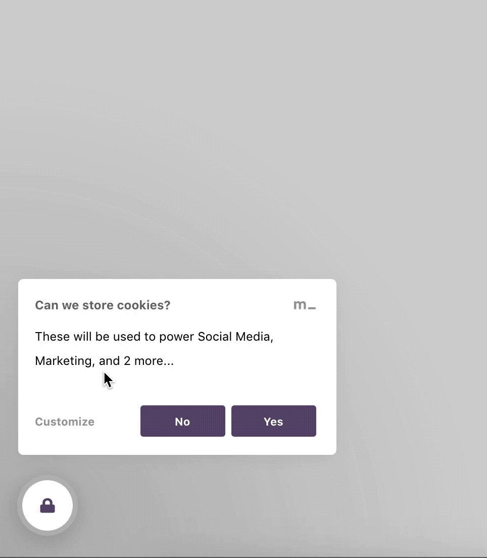
Essentially, less clicks to manage consent = closer to the GDPR standard. The first thing you may notice is that we added a ‘no’ button at the top level:
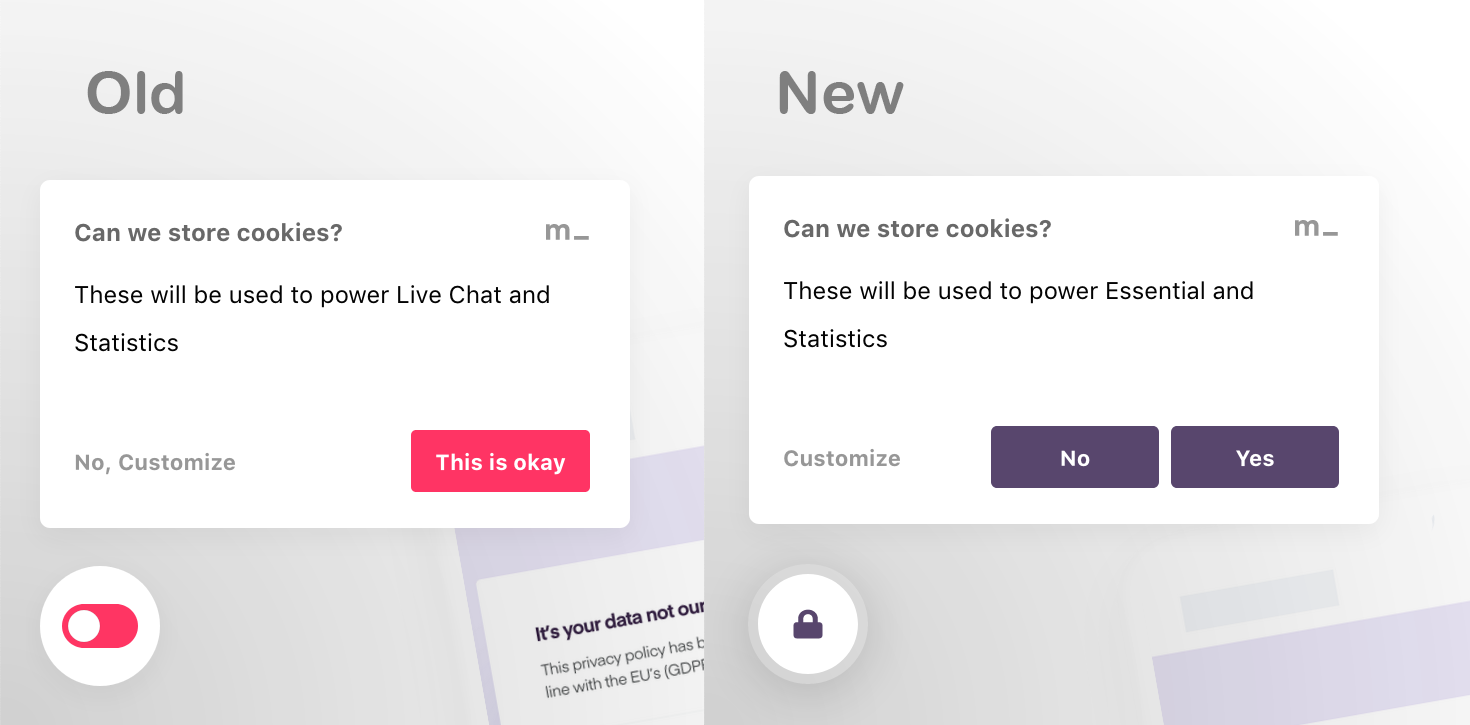 Yes, we added a ‘no’ button. This decision was important, and there’s a lot more going on under this top-level.
Why we added this no button: at the end of the day, the old widget did not actually match-up with our messaging as a company: to give users of the internet more control over the flow of their data. After all, if they can say ‘yes to all’ with one click, they should be able to say ‘no to all’ with one click, too.
With the order of these buttons (from left to right), we stuck with convention to avoid inadvertently tricking your users. So the affirmative action is right-most (‘Yes, I accept cookies’) and the negative action (‘No, I do not accept cookies’) is to the left. The action with the most control is left-most.
👉important note: if you use Contextual Consent on your site, this ‘no’ button is not a hard no — you may have a Youtube video on your site, and consent for cookies relating to this is managed only when your user interacts with the video. Sure, they could click ‘no’ on the Cookie Widget, but click ‘yes’ when they want the video to play.
Why the switch icon became a padlock: after a while, some of the main design-based feedback we got was about the icon. Is the switch on or is it off? Or is it just decorative? It was confusing, so we got rid of it.
These changes are automatic for new users. If you’re an existing user, go to the appearance tab on your dashboard to switch to the new look (if you want).
Clicking ‘No, customize’ will now bring up this feature screen:
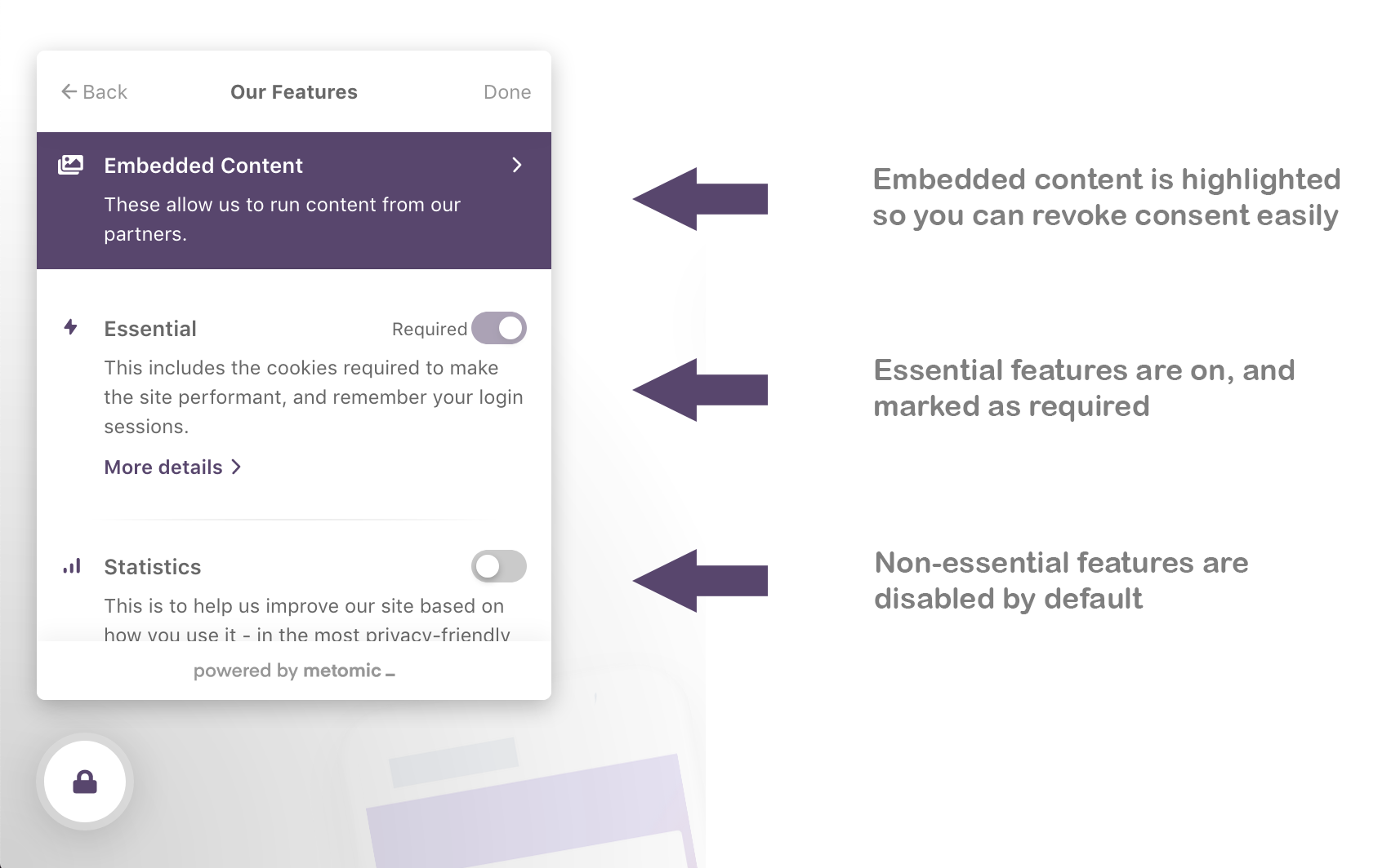
This new layout means less clicks: so your users are spending less time thinking about cookie consent and more time actually interacting with your site or product.
This feature list offers short descriptions of each feature, as well as consent controls, all in one view — no more clicking through to each individual feature screen.
You’ll also notice that we’ve highlighted ‘embedded media’: a user will see this when they’ve accepted cookies for something which is controlled with Contextual Consent. This is where they can revoke that consent, if they wish.
Ultimately, the changes we’ve made are centred around the idea that less clicks does the trick. With the old cookie widget, users had to click two screens deep if they wanted to manage consent — this somewhat went against our ethos of being transparent and easy to use, and that’s why these changes are so important.
Last but not least, if you use Scroll to Consent, the animation is now louder and more prominent. Like this:
The reasoning here is that if a user is doing something as passive as scrolling down a page in order to consent to cookies, it should be as obvious as possible, and they should be able to undo the action if they didn’t realise what was going on.
These changes were also made possible by community feedback
We’d like to thank everyone who’s been giving us constructive feedback over the months — feedback like this nearly always sparks big conversations in the office, and that eventually filters down into our product.

Shad Jahangir
Designer